Tuesday, November 28, 2006

Digital Stock... the WSJ checks in

This is a very interesting article at the WSJ. Hopefully some people who should read this will... and it should definitely spark some conversations. It is interesting that finanacial institutions would be so, uh... frugal, no - that's not it... STUPID... yeah, that's it.

The AD's who used the same images from a stock agency that was so lame that they didn't automatically check usage, should be selling fries somewhere.

Every time I used a legit stock agency they would let me know of prior use, or possible conflicts. What this tells me is that these guys either didn't check, didn't care, or used a cheap RF stock house for something as vitally important as these images were.

Simply amazing. Read it now before it gets behind the firewall at the WSJ.
The ad from Key Bank portrayed a heart-warming family moment: a dad pointing out something on his laptop to his smiling young daughter as she leans over his shoulder. In fact, the scene may have been a little too charming. The same image appears in a recent marketing brochure -- from Bank of America.

Both banks say they bought the image from a photo agency that deals in stock pictures, not realizing the other was making the same selection. "We try not to use the same images as other competitors ... if it happened, it happened," says Joan Peloso, marketing services director for Cleveland-based KeyCorp, the bank-based financial services company.

Monday, November 27, 2006

Fixing "Broken Windows"...

...in your business may achieve the same results as it did in NY. 37 Signals starts it off with this post:
"If you want to change big things, you pay attention to small things."
-Rudy Giuliani on C-span talking about the Broken Windows theory

The Broken Windows theory was the catalyst for solving NYC’s crime wave in the 80’s and 90’s. NYC’s administration had been focusing on major crimes, like murder, and overlooking smaller crimes along the way. But it wasn’t working. So the city started going after petty crime that it had been overlooking: turnstyle jumpers, squeegee men, public drunks, etc. The result: All crime rates fell suddenly and continued to drop for the next ten years.
This is similar to what I refer to as the 5% rule. Can you get 5% better across all the things you do? If you can, the quantitative increase is way more than 5%. Different discussion, maybe next week.

Websites for photographers have so many broken windows that it makes me crazy. Links that don't work, dead-end pages with no navigation, silly or nonsensical page names, crazy backgrounds, and layouts that hurt the eyes. Broken windows.

We could discuss boring answering machine messages, emails without signatures, noblog or news area, client disassociation and a myriad of other small items that when put together make a photographers business way more difficult. But for this post, we will discuss web pages.

Make a plan to look at your site with a discerning and somewhat cold eye. Then take a moment to answer these questions:
  1. Does the site navigate well? Can someone find what they are looking for quickly?
  2. Does the site intrude on a visitors time? (Long loading pages or silly intros that do nothing but show off your Flash guy's skill)
  3. Is the site up-to-date with the latest stuff you are doing? Does it have stale images and copy that refers to your vacation 2 years ago?
  4. Does the portfolio area change with new images added and deleted as you shoot them?
  5. Does the copy entice someone to seek you out? Do you have any copy? (Some big-time shooters have sites with no copy... fine. They also have reps and spend 10's of thousands on promotion above the website. If this is you, skip this post.)
  6. Do the images accurately reflect what you are doing? Do they reflect what you want to do? Do they have any reason at all to be there?
  7. Do you have contact information clearly notated and easily clicked to?
  8. Is everything spelled correctly, numbers correct, addresses and links and emails all clear and correct?
  9. Do your color schemes work to your advantage or do you have colors that are hard to see - or tiring on the eyes? Is your font selection big enough? Too big?
  10. Does the site offer a visitor a compelling reason to return? Are there areas that can help deliver your message in ways that could make a visitor decide to be a client... or at least consider that option?
There are far more questions, but as you can see above, the individual fixes are small, but the cumulative value is higher, far higher, than the sum of each item.

Mend the small things while working hard on the big things. Keep an eye out for those seemingly small things, that if not dealt with immediately, become aggregated into a site that says "I don't care about those who visit."

Sure you do. Just takes a little TLC now and then.

Sunday, November 26, 2006

Hey, wanna learn to play the drums?

Just do what these guys do. That really is all there is to it... oh, and you should know what a double-flam-paradiddle is, in case you should ever need one.

Technique? Steve Smith is thy name

Watch this amazing set of solos by the former drummer of Journey.

This great piece by his band, "Vital Information", is fusion at its best.

Here's one with some commentary over it... very cool!

Last, there's this short solo from "Nica's Dreams" - a standard Buddy Rich number. Steve is playing here with some of the guys from the Buddy Rich big band.

Saturday, November 25, 2006

Elvin.

Just that first name... still gives me a rush. I first heard Elvin Jones on the John coltrane albums that I started listening to in 1967. "Alabama", "Afro Blue"... they haunted me with his incredible rhythms and pure drumming excitement. He made me want to play jazz. He took a simple kit of four drums, a couple of cymbals and two sticks and made it the most exciting, personal thing I had ever heard. The tour de force that is "A Love Supreme" is, in my opinion, an accompanied drum and sax solo. Coltrane's masterpiece is also a powerful moment in kit drumming. Elvin is missed. His passing leaves a huge hole in the world of drums, jazz and humanity. Watch the master at work doing what he loved to do.

Here's Elvin backing Freddie Hubbard... or is Freddie backing Elvin?. I dunno, the drums are more than a beat, they are a flowing, pounding, driving part of the music.
One more; this a classic clip of Coltrane and the guys (probably one of the best quartets of all time) on Jazz Casual. Elvins multi-rhythms, tasteful beats and incredible sticking are a joy.

Friday, November 24, 2006

Site Alert: Yann Arthus-Bertrand


Yes, it is a totally flash site. It is, however, one of the best sites I have seen in a long time. The navigation is well laid out on the home page, the portfolio and other pages have a well thought out page design, and just enough interaction to make the site at once fun, inspirational and wonderful. The photographs are excellent as well as stylistically true to the vision he has created. I like the compartmentalized navigation and content areas, and the use of Flash does not become an end in and of itself, but yet a means to a well designe experience for us, the viewers. Well done, this site will really inspire you!

Below is a view of the main page, showing the grid of content and information to follow. The grid remains nearly constant throughout the site. The site of Yann Arthus Bertrand.

Mixing Hot Lights and Natural Light


This image was shot quite a while ago, but it shows some lighting choices that can make a shot more interesting. The setting is a large industrial building that was being renovated, and the model and I went in during a lag in the work. I knew I wanted to use that large window to add the feeling of overwhelming back light. The key was to let it overexpose, but not to the point of totally blowing out the frames.

The model was in the foreground, and I chose some tungsten lights to add the fill. I let the background light be 1.5 stops over the exposure based up0n a reading at the bright part of the floor. Polaroids were used to confirm settings. I also placed two fill boards to soften the contrast and add texture to the column she was leaning on. Both were white fill boards on stands and one is directly next to my camera (left) and the other is at an oblique angle to the column. The light, a 1000 watt Tota, is on camera right, bouncing into a large silver umbrella and is placed slightly behind the models position adding that feeling of backlight you see to the right on the dress. Hair light was a natural effect from the bright windows above the view of the camera. The camera fill board was also collecting light from the Tota. (Note: important to have very good lens shades, or a Gobo to block the umbrella lighting from hitting the lens directly.)

Camera: Mamiya RB with 50MM wide lens at f4. Film was T-max 400 and the scan was done on a good flatbed. Post processing in Photoshop included burning the wall on the right, and carefully working the texture in the dress and lace. I decided on the sepia look as it warmed the image up nicely and added a feeling of 'antique', to match the style of the dress and the retro look of the lighting and environment.

Thursday, November 23, 2006

Happy Thanksgiving

I may post some stuff I have been working on for a while later today, but for the morning it is cooking, helping the wife, watching a movie with the kids. Really important stuff. Seriously.

Thanks...

For my family.
For great clients who treat me fairly.
For friends who keep me focused.
For friends who encourage me to go wildly into uncharted waters.
For the opportunities that this great land affords us all.

Thanks to...
Those special men and women that are in harms way today in places that are hard and dangerous. Thank you for doing what you do. Stay safe and come home with a great sense of accomplishment.

Cheers!

Wednesday, November 22, 2006

Art Face-Off...


Let's vote on art. What?

I am not sure about this. Democratizing art? Voting for one against the other may be fine, but are there any controls over those voting? LaVerne and Shirley were #1 for years on TV. People crowd to get into the most lame recording artists because they are 'hot' today (generally the result of being 'pushed and groomed' to the masses.)

Would the "Mona Lisa" or "Moonrise, Hernandez, New Mexico" fare well when pitted against something more modern? Would that matter?

More than the 'face-off' itself, I think this site may say a lot about where art is going for many people. In the end it is up to you if you want to go that way, but this site is guaranteed to stir controversy, angst, anger, joy and more.

I just keep thinking that the likes of the homepage Digg'rs now will have the ability to share what they think art is. Makes me very queezy. Very.

Personally, I am not feeling very good about it, but it may be something you want to check out. Could be just what you are looking for. Art Face Off is an intruguing idea, and will probably spawn some interesting iterations down the road.

Digital Camera Carnival at Instapundit

Here is a really great roundup of digital camera links. I missed the entry due to being literally overwhelmed with DVD orders, three shoots, a website and redesigning my site. Sorry I missed it, however, I will be making a decision later today on whether to get the 30D or the 400D. Leaning toward the 400D for lots of reasons, but the most important is that the 30D is coming up on the next version, so waiting a few months for cutting edge may make sense. I'll let you know and do some testing.

Meanwhile, over at Instapundit... read, ahem, the whole thing.
The short answer is that it's hard to buy a bad digital camera any more. Most anything in the $200-400 range will be very good, and pretty easy to use. I'm quite happy with my Sony DSC-W7 pocket camera, and you could drop to the 5-megapixel DSC-W5 without sacrificing very much. Ann Althouse has this small Sony, and a look at her blog will illustrate that it does excellent work. Unlike mine, though, it uses a proprietary rechargeable battery instead of AA batteries. I like the flexibility of being able to pick up fresh batteries anywhere in a pinch, though in truth I seldom have to do that.

You can spend some time here...

Stephen's Flickr set on Glamour is really fun. Lots and lots to see. I personally like the wide variety of composition, lighting and stylistic approaches. Great work, Stephen.

Tuesday, November 21, 2006

Natural light portrait: Tammy


I threatened to do this, and here it is. This portrait was created when Tammy came to see me about an interview. She is standing in the doorway of my office, under a 3 foot overhang on a warm spring day. The light is simply the open sky behind me and a row of white office buildings across the street. My entry walls are light, slightly warm colored as well, and the bounce in that area is very nice. I maintained a distance and shot with 200mm on my Canon. ISO 400 to make sure that the shutter speed was up a bit for sharpness. I didn't do any custome white balance, just shooting the auto white balance. The warmth of the walls did fine for adding a touch of color.

Post production including slight darkening of the office area behind her and some contrast control to make her pop out a bit more.

Natural light headshots are a favorite of mine, and this shot shows how pretty northlight can be. I recommend working in that lovely north light shadow area with a large sky behind you. If you can find an area that has some white or very light buildings behind you, that can be a wonderful area to shoot some very pretty portraits.

A Couple of Good Reads

Take a deep breath, oh yee of the mega-mega cult, err... faith... Then read this post. Take a few moments and some deep breaths... and then read on.
Now, every time I write that, I hear from furious or baffled readers. “I don’t get it,” wrote one. “A ten-megapixel camera produces photos about 3640 pixels wide–enough to make a 12-inch print at 300 dpi (dots per inch) on a good printer. Sure, you can go lower, but quality is sacrificed; you can’t make an 11×14 print, let alone anything bigger.”
OOPs, guess I need to take those tack sharp 24x36 inkjets down from the office wall. Yeah, right.

This is kinda fun!
Winners of the Fall 2006 Edition of Hey, Hot Shot!.
Check out the Competition Blog to read the artists' bios and statements.
Wynn Bullok over at VisualVille Blog.
"Wynn Bullock was multi-talented, beginning his artistic endeavors as a concert tenor, with success on Broadway and studies in Paris. While there, he found further inspiration in the art of the recent French masters, most notably Cezanne, and also in the groundbreaking explorations of Moholy-Nagy and Man Ray.
Want a cool place to put some images for your blog or social networking site? Check these guys out.

Choices

David's Strobist post got me thinking about why I make the lighting choices I do. I decided to show the four images currently on my home page and discuss the choices and reasoning behind them.

The first image is a headshot for a haircutter here in Phoenix. We had to come in and set up in the lobby, then shoot 24 of their customers for wall art and website use. My choice was strobe for many reasons; bad light in the lobby even though there were abundant windows, two different color temps of lights along with daylight, and I wanted to make sure that the hair would show clean and sharp. 56" umbrella with white liner on subject right, two fill cards - one below the subjects and one to their left, and white/black background depending on hair color and contrast. I ended up dumping a head out the door so I could maintain a very limited depth of field (f4 with 150mm approximately). I wanted the image to transcend the normal 'portrait' look that f11-16 would have given me and yet be subtle. The result was exactly as I envisioned it.

The second shot is of Erica in the studio. Large softbox for fill on her left, bright medium umbrella right over camera for main, and small softbox over her right shoulder for hair light. I wanted liquid highlights on the leather jacket, a look of smoothness for her skin and for her to jump off the background. Even though this light looks simple, the complexities are there in delivering the subtle mix of fill and main, bringing out the texture on the leather and the wink of backlight to give the image depth.

Lynne on the stairs downtown was simply shot. No fill flash or bounce cards... 'cept for that big ol building across the street that lit the area up so nicely. Having her sit on the stairs and lean into the railing was all I needed to do. The walls to our right and left were also very bright. Could I have added a bunch to it, sure... but the overall natural look, including the highlights in the eyes may have been lost. It is important to know when you need more and when what is there may work just fine.

Michaila in the studio. This image was shot for the DVD tutorials. It is showing what you can do with fome-core and Home Depot lights. I used a very large main card and a small v-card for fill. The point of the shot was to show my little girl growing up. I wanted to capture that moment between youth and young adult. So the point of the light was to be unobtrusive and subtle. Almost like it wasn't important. I like to do work that looks like natural light, but is done with lighting. Not bringing in a 'hairlight' makes the image a little more accessible, at least to me.

The important thing for these images is that I knew what I wanted, and knew what they were going to look like in presentation.

This is a type of post I will continue doing as David has inspired me to share even more.

A Lighting Journey

Sheesh, another tremendous post over at Strobist. David is hitting on all cylinders. Read this lengthy and well written piece on lighting, technique and style.
I absolutely love seeing the ways new-found lighting enthusiasm expresses itself in people's images. I see every single Strobist pool photo, and look forward to picking a shot out for POTW each Friday.

I think the kick, for me, is not about where you happen to be on your personal lighting journey, but how hard you are crashing up against your ceiling as you try to get better.

That said, I believe that all photographers experience a fairly similar series of growth phases as they strive to improve at lighting. Some people may blow through the phases, while others get to a wall - of comfort zone - and camp there for a while.

And once in a great while, someone seems to transcend this process and become the lighting equivalent of Yoda, able to snatch the X-Wing fighter out of the swamp with the sheer power of will. These guys have no predictability to their lighting other than extreme quality.

Monday, November 20, 2006

Thanks David! Wow!

I awoke at 5AM and tapped the keys of my laptop. Check email, load my NetVibes page, check the feeds... and notice a new post at one of my favs, Strobist. Titled Glam I Am, I naturally click on it as I shoot a lot of glamour. Imagine my surprise and joy to see that David had reviewed my DVD. (I sent him one realizing he was very busy, and he said he would take a look.) I never expected such a long, and thoughtful review. We are all so busy, and David took the time to really look at my effort.

I only recently found "Strobist", and have been so busy that I haven't even joined his Flickr group, something I intend to remedy later today. What I love so much about his site is the constant learning that happens there, and the belief that equipment should be a tool of creativity instead of creativity being a slave of equipment.

My workshop on Saturday was all about that, and I will post about it later today as well.
Arizona-based photographer Don Giannatti has produced a multimedia DVD entitled, "Lighting Essentials 1".

Basically, he shows you how to make the lighting version of stone soup out of a couple of Home Depot work lights, some translucent material and some foam core boards. He moves to speedlights and bigger strobes, but the reflective and diffusion techniques are pretty much universal.

If you are into shooting models' headshots, senior portraits or anything of that ilk - or aspire to be - this would get you well on your way to being able to make some very cool-looking people shots on an utterly draconian budget.

Friday, November 17, 2006

Hey, did ya ever...

... want to share something on a website with someone else? Or make a note to yourself when visiting a site? Or make a notation and be able to find that note later - on the site you were looking at?

Yeah - me too. Now comes this cool little tool and it allows you to do just that.

I can make a notation on a page of a website, then share that note with a client or use it for research - all kinds of things. This is the kind of useful web tool that can help you research clients for marketing, make notations on ideas for later and more. I think it is kind of cool. See Fleck.com for more ideas.
Fleck.com wants to add a new layer of interactivity to the web. Fleck is inspired on a story written in 1945 by Vannevar Bush and an article titled 'We Are The Web' by Kevin Kelly.

Vannevar Bush predicted a machine called the Memex that would allow people to surf from one information page to another. Some people say that Hypertext and the World Wide Web are based on or at least inspired by the Memex.

Thursday, November 16, 2006

Killing an Idea

Funny, and a bit poignant, post over at Berkun Blog.
Last week in the creative thinking course I’m teaching at UW, we spent time listing idea killers. Statements we’ve heard, or used, that stop ideas in their tracks. Have any to add?
My faves:
  • Not in our budget
  • Not an interesting problem
  • We don’t have time
As a creative, I have heard these and more. I may post a few of the ones we have heard lately if I can find a few moments this evening.

Killer Site / Killer Shooter


Steve Giralt's site is a pleasure to view. Very simple navigation, large images presented well, and the images themselves are amazing. You have to see his site. Yes, it is total Flash (grrrr), but it is nonetheless sweet. Enjoy.

Larry King on Larry King...

and the result is disgusting. Can you imagine this guy likes to think of himself as a 'playa' in the news and information cycle? He has advice and opinions on current happenings. He can't wait to tell us what he thinks. And he doesn't know how to "push those little keys..." and such. Watch and remember the next time this fool tries to tell you anything about anything.

Stephen Shore


I was cleaning out the area in the garage where I keep a lot of my art books (all wrapped and protected, of course) and noticed a box that needed some work. (Before you write me telling how awful it is that my books are in boxes, know that I am having a huge bookshelf built in the family room that will hold them. I love books. A lot.) In the box I found one of my favorite books by Stephen Shore. I had been thinking about his quiet style for a while now and finding this book was almost eery. The book, "Uncommon Places", is powerful for its gentleness. Shore's images present a world that is right around us, but unseen for its familarness. Shore isolates and deftly composes the natural world in such a way that the seemingly mundane becomes a tapestry of discovery. UCLA has a nice page on an exhibit of his here: they refer to his work as Biographical Landscape.

This quote from Shore is at the Getty page:
A quote that I like very much... comes close to explaining my attitude about taking photographs.... "Chinese poetry rarely trespasses beyond the bounds of actuality... the great Chinese poets accept the world exactly as they find it in all its terms and with profound simplicity... they seldom talk about one thing in terms of another; but are able enough and sure enough as artists to make the ultimately exact terms become the beautiful terms."
--Stephen Shore
His work in the commercial realm is equally fascinating and you can see some of that here.

Stephen Shore is a photographer that continues to inspire me, and the ability to go between the worlds of fine art and commercial should be an inspiration to all of us.

Wednesday, November 15, 2006

Wonderful!


Isn't it great when someone who is knowledgeable decides to share his/her knowledge with the rest of us. This is a great little site with images and lessons on creating the images. Take a look. Even if you are a full pro, you will find some interesting images/stories here. And if you are still learning... be prepared for a schoolin'.
A lot of news photographers don't think that they are allowed enough time to light pictures, so they rely on their hot shoe mounted flash or on moving their subject into the daylight. If your kit is lightweight and well planned, if it's reliable and quick to assemble then you can light as much of your work as you want to. I tend to specialize in editorial portraiture, so that is the area of work that I'm going to talk about. My basic kit is one Lumedyne 200 joule pack, one standard head, two regular batteries, one stand, an umbrella, a Chimera softbox and a Pocket Wizard kit - all in one sling bag. In October 2003 I have added an Umbrella Box to my kit in the hope of replacing two light modifiers with one!

Experimenting with YouTube

Looking for the correct compression on my end to make a decent YouTube vid. This one isn't bad, but I am continuing on. Thought you would enjoy this one. The music is courtesy my good friend Jeanne Newhall - visit her site here and buy the new CD, "Wild Blue", from which this piece is taken.

Tuesday, November 14, 2006

Well - this is kinda cool

Just thought I would experiment a bit with it...
Learn about HotListMaker
I'm Listening:
Music that inspires me while I work
A Love Supreme, Part 1: AcknowledgementA Love Supreme, Part 1: Acknowledgement - John ColtraneListen
Buy
Afro-BlueAfro-Blue - John ColtraneListen
Buy
A Simple Matter Of ConvictionA Simple Matter Of Conviction - Bill EvansListen
Buy
Embraceable YouEmbraceable You - Jane MonheitListen
Buy
Almost BlueAlmost Blue - Diana KrallListen
Buy
I Loves You PorgyI Loves You Porgy - Keith JarrettListen
Buy
Make a HotList
Share this HotList

Monday, November 13, 2006

You must see this site...


...absolutely must. It is one of the most incredible sites you will see in the near future. And, get this, it is a photographers work that is featured. "Ashes to Snow" will amaze you with it's grand scale and incredible imagery.

Hats off to the designers. This is one of the best Flash sites I have ever seen. Everything makes sense... color, design, interactivity, navigation and effects... I can't say enough. I say no more after I say this... see it. See it now.

Heroes - Scott at Visualville shares some thoughts...

If you are not following Scott's Visualville Blog, you should be.
Minor White
" Minor White was one of the greatest American photographers of the period after the Second World War as well as one of the greatest teachers of the medium. One of the best-known names in photography until the end of the 1970's, his life and work has since virtually dropped out of photographic discourse.

Friday, November 10, 2006

I liked this guy

... and now he's gone. Some people in any industry end up being icons. This guy did, I have my doubts about others in his field. Happy trails, Jack.
LOS ANGELES - Jack Palance, the craggy-faced menace in “Shane,” “Sudden Fear” and other films who turned successfully to comedy at 70 with his Oscar-winning self-parody in “City Slickers,” died Friday.

Jack in "Justine."

And this from "Sudden Fear" back in the early 50's.

YouTube's Cool Stuff

Bill Simmons over at Page2 has some good blogging about YouTube... with a bunch of killer links. The one I thought was cool (actually most of them are cool, but this one stuck out), was the one of Crockett and Tubbs on the Miami Vice Pilot. Do you remember how long ago that was? Take a look at shows that were playing the year that MV came out and then watch this clip with the soundtrack of "In the Air Tonight" playing... really a smart 3 minutes of film in that genre. Much of the drivel on TV could learn a thing or two from watching true innovation.
Of course watching Phil do it live is pretty damn cool too.

I have been busy....

...sometimes I think too busy. Anyway, busy is good.

However, finished this cool little site for my friend Steve Burger who owns Pro Digital Image, a Photoshop Training workshop here in Phoenix. He is really a guru in P-shop and working with him is aways a learning experience. We should be making this site live very soon. Check over the weekend.

UPDATE: The site is now live. take a look and let me know what you think.

Monday, November 06, 2006

FilmLoop 2 (Beta) is ready now


Take a look and download the new FilmLoop 2.0. This little tool will allow you to do more things than the previous version - and those things are pretty cool. Tell stories, post comments and do some serious story telling. I use these things all the time, finding that they help me keep clients excited about my work.

Saturday, November 04, 2006

Weekend Concert: Saturday Edition

Yes... it's Patti LaBelle workin those pipes like only she can. Hold on to the chair.

If you haven't discoverd Audra McDonald... where the hell have you been.

And this for the Saturday finale... ahhhh, man that's nice. Audra McDonald, Judy Kuhn Marin Mazzie and the songs of Lloyd Weber.

Tradmark Riffing at Seth's

This is a great riff, Seth. Lots to think about. Read the whole thing. Then... read it again.

In order to make it a trademark, most lawyers agree you need to follow a few superstitions (superstitions because there's no official manual with definitive answers). The first is that you ought to make it clear to the world that you know it's a trademark, that it indicates your product comes from a specific source. So, putting (tm) after your mark helps... and once per page/interaction is generally considered to be enough. So you don't have to repeat the (tm) over and over and over again in your copy or brochure. It's tacky.

Adding (c) after your name is just dumb. It doesn't mean a thing.

You can trademark just about any word or phrase, but that doesn't mean it will hold up. The best trademarks are 'fanciful', words like Yahoo! or Verizon. Next down the list are words that a bit descriptive, like Woopie Cushion, Wikipedia or JetBlue. The worst kind of words are descriptive. Yes, you can trademark the brand American Motors, but don't expect it to be particularly valuable or long lasting.

Thursday, November 02, 2006

Chase Says "Focus" - He's Right

This important post shows how positive thinking and the embracing of change can be far more powerful than all the whining meetings held in morose settings ever could. (I've attended far too many of those and now bow out... such negativity can become toxic.)

BTW... this guy has a killer portfolio. Take a look at this level of photography, presentation and killer creativity and enjoy. As for the article, read the whole thing.
Important distinction: Yes, the marketplace is absorbing images from amateur "photographers" who have no overhead, since they likely have other jobs. (Read iStockPhoto, Flickr, etc) Yes, in many cases, those photos can be licensed, or (gasp!) even purchased outright for a handful of meager dollars. Yes, some agencies have digital cameras and are sometimes taking pictures that they used to contract out for... BUT if you're worried about (basically) non-professionals stealing your job or your income, then the last thing you need to be worried about is the great quality of new point-and-shoot cameras and how you can suppress this... - you need to focus on YOUR business model, the quality of YOUR images, and even moreso, the quality, level of service, and problem solving ability that YOU'RE claiming by even calling yourself a "professional" in the first place.

Thus, the message is this: if you're livelihood IS somehow in jeopardy and you find yourself somehow getting hammered as a professional photographer, you shouldn't worry, you should focus your energy and become a better artist and business person. Remember, whether you think you can succeed, or can't succeed, you're right. Examine your business model and your skills and ask yourself: How can I change and grow? What are the new opportunities that this changing environment can offer? What do I have to do to differentiate my work from this new wave of low end photography out there? Dollars will be there for anyone who understands the market and creates great pictures.

Wednesday, November 01, 2006

New Business Models (2)

Collaboration and Maintaining Client Relationships

The new web (commonly called Web 2.0) is about relationships, interaction, communities and networks. Sites like YouTube, MySpace and Flickr are showing memberships in the millions. Relationships and collaboration will be the new way of doing things in the very near future. It is vital to be able to communicate with your clients about jobs, ideas, sales and more.

E-mail is the standard at the moment, but it is losing its luster as spammers, phishing, spoofing and even more insidious forms of cyber terror (and that is exactly what it is) seem to be replicating themselves in ever spiraling amounts. As we see more and more people not wanting to share information, and email addresses for fear of getting ten thousand emails about Viagra, the press is on to find better ways to communicate safely.

Enter closed networks, Peer-to-Peer, drop-off sites and more. Using these tools, most of them free, lets you communicate a level of trust that will help your clients feel warm and fuzzy about working with you.

Currently I use Box.net for sharing files as well as E-Snips.com. I have free accounts at both and will probably get a professional account at one of them soon. I can create private boxes, shared boxes and public boxes that will allow clients to pick up files, images and video clips.

You can also use Flickr and Zooomr to show and distribute hi-res files. By making sets of ‘Friends’ and family, you can upload hi-res images that can then be shared by whoever you have identified as having permissions. Yes, there are lots of other tools that you can use, but I am showing you what I do, and how it works for me.

Google and Yahoo both have sharing, web galleries, private and shared and more. Just look for sharing sites to store your files with permissions you set.

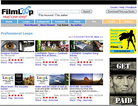
Many photographers are now building portfolios at Flickr, Zoomr, MySpace, MSN Spaces and Squidoo. These community sites all have free membership and tremendous traffic. A great way to show work, meet people and also to develop a fun place to have clients go to see what you do.

Blogs, and not just PhotoBlogs are one of the best ways to keep your clients entertained and coming back for more. I maintain a blog that is somewhat professional in scope (wizwow.blogspot.com) and one that is purely for fun (dongiannatti.blogspot.com). I also have a photoblog at my-expressions.com. I get lots of referrals from my fun blog and they also then go over to my site from all of the blogs. My posts at the fun blog are mostly personal and show images from portrait shoots, glamour shoots and whatever catches my fancy. However, when the brides and prospective brides visit that blog, they share it with all of their friends.

There are even more untraditional ways to show your work, gain interest and guide your clients and prospects to. Sites like Fine Art Nudes and Fred Miranda showcase photographers work and can lead visitors to your personal site. Look for these ‘collective’ sites and join, show your work and create interest in what you are doing.

Mighty Imaging, a lab in Phoenix, AZ provides gallery space for photographers wishing to sell display prints. Mighty allows the photographers to set their price and Mighty Imaging only keeps their published print pricing, allowing the photographers to mark up the images whatever they want. This helps the photographers by providing access to their images to the MI visitors and allows the visitors to the galleries to see the products that MI offers. Powerful synergy, and the combining of visitors to both the photographers and the lab make it something that virally increases awareness of both.

Keeping in touch with your clients couldn’t be easier these days. Constant Contact (constantcontact.com) is one of the easiest and most cost effective ways to maintain a monthly newsletter or email and generate trust while showing value. Pick a template, write an article, mention your cool jobs, and send it to your list.

Keeping your website up to date, maintaining a news section, adding new images and making fresh content is another way of keeping your clients involved. Sites that never change are somewhat offensive to me. It is like saying, “Look, we don’t care enough about returning visitors to change our site at all…” – and that is simply wrong. Returning visitors are exactly the group you want to impress.

If you can’t change the text, add images and galleries whenever you want, and tweak the meta-content for search engines, then the site is too rigid and will not do you well as a tool for growth. These days, photographers should be able to maintain a dynamic site from their computers online. I am not advocating learning Dreamweaver, but Contribute is easy, as is a Total-Control-Site.

There are many more ways to stay connected to your clients, but the above will give you a good head start.